


The ROI of Website Speed: Why a Fast-Loading Financial Advisor Website Converts More Visitors
The time it takes your website to load is probably costing you qualified leads.
See, if you run a firm, the simplest way to get in front of more leads when thinking about your financial advisor website design is speed.
Factors like design, messaging, imagery, calls to action, and more play a vital role too, but all of those do you no good if your prospects are bouncing before they see what’s above the fold.
When your site loads instantly, prospects stay, scroll, and schedule. When it drags, they bounce—and you’ve paid for a click that never became a conversation.
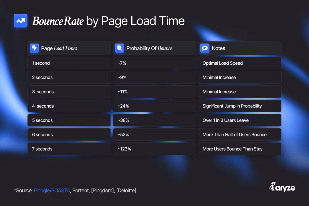
A fast advisor website books meetings; a slow one sends prospects back to Google (and your competitors). Google’s own research found that as mobile load time climbs from 1s → 10s, the probability someone bounces jumps 123%—you can literally watch conversions evaporate with every extra second.
Speed → Lower Bounce → More Leads (in plain English)
Faster pages keep people around long enough to read your story, understand your offer, and click your primary call to action (“Book Your Free Assessment” or “Could We Be a Fit?”). Multiple studies show the same pattern: faster pages convert more visitors. In B2B, pages that load in ~1 second convert 3–5× better than those that take 5–10 seconds.
And Google keeps repeating the point: “No matter what, faster is better and less is more.” Heavy pages correlate with higher abandonment; most mobile pages are still over 1–2 MB—exactly where your bounce rates will start spiking.
Practical target: keep any single page under 2 MB, and aim for ~1 MB or less for truly snappy performance on mobile. That’s roughly half today’s median page weight, which is why it feels fast. Lighthouse even flags “enormous network payloads” when pages get too heavy. (Web Almanac)
What This Actually Means For Web Design For Financial Advisors
A good financial advisor web design needs more than to look polished (although that too is a huge driver of conversions); it must load quickly and stay easy to navigate. Here’s how to make speed tangible:
Use light, modern assets.
Convert images to AVIF or WebP (and SVG for logos/illustrations). These formats are far smaller at the same visual quality of JPEG’s or PNG’s—don’t worry, JPEG’s and PNG’s can easily be converted—which means faster pages and lower bounce. Google’s performance guidance literally recommends “next-gen” formats for this reason.
Keep videos on a strict diet.
I can’t stress this enough. Videos are engagement gold and a common speed killer. Host them on a platform (YouTube/Vimeo), use a static preview image, defer loading the player until someone clicks, and avoid auto-play on mobile. Web.dev’s video best-practices echo all of this.
Fonts matter more than you think.
Custom fonts can block text from showing; use system fonts where you can, limit weights, and set font-display: swap so text appears immediately. Google’s guidance is pretty explicit here.
Audit with Lighthouse like a checklist.
Open Chrome DevTools → Lighthouse, or run PageSpeed Insights. It will spell out which images are too heavy, which scripts block rendering, and what to fix in plain language—no dev degree required. HubSpot’s walkthroughs are a friendly, step-by-step intro to using these tools.
A quick, human way to summarize: light media, fewer scripts, smart fonts, simple layout, and regular Lighthouse checks. That’s it.
The Site Structure That Wins (And What to Put on Each Page)
Advisors succeed with a website design for financial advisors that mirrors how prospects research: clear paths, consistent navigation, and zero friction. Stick to a conventional, high-performing IA (information architecture)—it keeps engagement high and pogo-sticking low (another bad signal to Google). The structure below aligns with what I outline in my architecture guide for advisors.
Home—Clarity in a mere 5 seconds.
Who you serve (“We help [niche]…”) + the core outcome you deliver. Add 1–2 trust markers (designations, media logos) and a primary CTA: “Book Your Free Assessment.” Don’t let hero images exceed ~200–300 KB, set to eager load, compress and serve as AVIF/WebP.
Follow the StoryBrand framework and you’ll be in a great spot: start with a clear hero section that defines what you do and who you do it for; reinforce your credibility with key accolades; highlight the pain points your niche struggles with and the benefits of how you solve them; capture leads through a valuable free resource; share a concise introduction to your team and process; preview your latest blogs or podcasts near the bottom to keep visitors engaged; and close with a clean, well-structured footer that ties everything together.
About—Credibility + relatability.
Add a short section that highlights three quick ways your firm stands out, followed by a team section that introduces each advisor. Include where you’re based and whether you work with clients locally, across a few states, or nationwide. Use professional, optimized photos, and link each team member to their own page with a short bio and a click-to-play video that uses a light preview so it doesn’t slow your site down.
Services / Pricing—How you help + what it costs.
This one’s a little controversial—but we’ve seen enough data across the advisor websites we’ve built to know it works. Be upfront about your pricing so prospects know exactly what to expect. Break down your packages or planning tiers and what’s included, and keep the page simple, clear, and easy to scan.
Contact—Frictionless next step.
A short form (name, email, ideal meeting time) and a scheduling link will suffice. Don’t embed heavy map widgets unless they’re essential—use a static image that links out to maps if needed.
Blog / Insights—Proof of expertise.
Answer the exact questions your niche asks (“How much cash should I keep in retirement?”). This is where Ahrefs/Semrush research helps you target terms with search demand and build topical authority. Target easy to rank for keywords with high search volume.
Free Assessment—Your conversion workhorse.
Explain what your free assessment looks like, who it’s for, and the outcome (“a 3-point plan or a referral”). Keep it lightweight and distraction-free. We typically include a section that explains who you do your best work for—your niche—along with a deeper look at your process. Then, add a middle-of-the-page call-to-action to keep visitors engaged, followed by a short FAQ section to answer any lingering questions before prospects book. Finally, close with your embedded scheduler—we usually recommend Typeform or Calendly.
Which financial advisor website builder is fastest?
Here’s an honest comparison—I have personal experience with each of these financial advisor website builder solutions. To preface, all of these can be fast with disciplined build practices, but some make speed easier out of the box.
1) Webflow (my top pick)
Webflow’s hosting runs on AWS + Fastly CDN, which means your pages are served close to visitors around the world. It auto-minifies code, supports responsive images, and makes it simple to ship lightweight pages. Design flexibility + strong performance is why many agencies default to it. (Webflow quietly optimizes the nerdy stuff like LCP/CLS/INP/CrUX… which will likely shoot right over your head, but should bring you peace of mind.)
Some advanced SEO/structured-data use-cases require a bit of custom work. Still, this makes it the best financial advisor website builder. Checkout our builds on Webflow here!
2) Framer
Framer ships fast, modern sites with automatic image optimization and a global edge network. This tool is built for designers, not web designers or developers—unlike Webflow—so it’s a bit less sophisticated. Designers love the animation tools. The caveat: go easy on those animations—overuse can drag performance. Advanced SEO features (e.g., nuanced schema) need workarounds.
3) WordPress
WordPress can be extremely fast on solid hosting with a lean theme and minimal plugins—but plugin bloat and heavy page builders often slow sites down. The ecosystem keeps improving (WP 6.5 shipped notable performance gains), yet speed still depends on disciplined choices (hosting, caching, image strategy).
4) Squarespace
Squarespace has improved, and many sites now pass modern performance thresholds. Still, heavier scripts and render-blocking assets can be limiting, and you’ll have less granular control. Their own docs emphasize trimming page size to speed things up.
5) Wix
Wix has made real progress—automatic WebP conversion, lazy-loading, and rising Core Web Vitals pass rates. The flip side: you can’t always control underlying scripts, so extremely tight performance budgets can be harder.
6) FMG (advisor-specific platform)
FMG wins on compliance workflows, not raw speed. It’s convenient and purpose-built, but you trade away some performance control and design flexibility. If you choose FMG, keep pages extra lean and audit often. You may even want to hire an external web designer to optimize your content on their platform.
Exactly how to get faster (without becoming a developer)
1) Run a Lighthouse check monthly.
Treat it like a health screen. Fix the top opportunities, then check again. HubSpot has approachable guides if you want the hand-holding version.
2) Put your media on a “speed diet.”
- Convert hero images to AVIF/WebP.
- Keep hero images under ~200–300 KB; most other images <150 KB.
- Replace decorative PNGs with SVG.
- For video: lazy-load the player; use a thumbnail; consider a short, compressed MP4 only when it adds clear value.
3) Fonts: fewer, faster.
One family, two weights, font-display: swap. If you love a custom typeface, self-host and subset it.
4) Keep the page under 2 MB (aim for ~1 MB).
Most sites on the web are heavier than that—don’t be “most sites.” Less weight = fewer bounces.
5) Mind your add-ons.
Every chat bubble, scheduler, or analytics tag adds delay. Load third-party scripts after interaction or on the pages that truly need them. (Your audits will call out offenders.)
Engagement tactics that actually convert
- Write for one niche. Specialists convert better because copy feels personally relevant—your web design for financial advisors should reflect who you serve, not everyone. (Ahrefs’ data on how few pages earn organic traffic is a reminder to be focused, not generic.)
- Answer the exact questions your prospects Google. Use Semrush/Ahrefs to find the phrasing real people use; post concise answers on your blog and service pages. Then link to your CTA: “Book Your Free Assessment.”
- Use a consistent layout. Keep navigation simple—Home, About, Services/Pricing, Blog, Contact, Free Assessment—so no one gets lost (and so Google reads your site as well-organized). Google’s SEO starter guidance explicitly stresses clear navigation.
- Measure what matters. Track engagement, not just traffic: bounce, time on page, and conversion rate from your key CTAs. Google Tools like Search Console, Analytics, and Tag Manager make this so incredibly seamless.
A Quick Note On The “Alphabet Soup”
It would be easy to get lost in the weeds. Advisors don’t need to memorize LCP, CLS, INP, or CrUX. But it’s comforting to know your builders and audits care about them behind the scenes. Lighthouse and PageSpeed Insights keep score on those signals so you don’t have to. (If you’re curious, Google and Ahrefs have plain-English overviews.)
Bringing it all together
A fast financial advisor website builder + disciplined financial advisor website design = lower bounce, higher engagement, and more qualified “Could We Be a Fit?” conversations.
Keep pages light (≤2 MB; shoot for ~1 MB), use modern image formats, tame fonts and scripts, audit with Lighthouse, and stick to a familiar, conversion-focused architecture.
Do that, and speed will quietly multiply the ROI of everything else you do—SEO, ads, content, referrals—because more visitors will actually stick around long enough to meet you.
Looking for a website that loads in under 2.5 seconds? Book your Free Assessment today!
Where Advisor Brands Get Stronger
Conversion-focused advisor website updates, niche messaging, and search visibility—so you see measurable marketing progress.

Generative Search is Still SEO. AEO + GEO Are Tactics to Sell You.
Confused by AEO and GEO pitches? Google says optimizing for generative AI search is still SEO. Here's what's real, what's recycled, and what to focus on.

Measuring What Matters: Simple Marketing KPIs for Financial Advisors
Learn the key KPIs advisors should track—leads, meetings, CAC, CLV & website metrics—to measure marketing performance & build a predictable growth engine.

Your Step-by-Step Guide to Marketing Funnels for Financial Advisors
Learn how financial advisors can use a simple 4-step marketing funnel to attract prospects, build trust, convert leads, and create lifelong clients.

Your Advisory Website Is a Pre-First-Meeting Experience
Learn how a strong advisor website builds trust, lowers acquisition costs & turns curious visitors into booked meetings by showing relevance & credibility.

What Makes a Great Logo for Financial Advisors?
Learn how to choose a logo that resonates with your audience, reflects your brand’s values & hot to find the right designer to bring your vision to life.

Website Architecture Essentials for Financial Advisors
Learn how to structure your financial advisor website for better user experience, SEO, and conversions. Optimize key pages, improve navigation, and more!
Video Marketing Strategies for Financial Advisors
Learn how financial advisors can use video marketing to build trust & engage prospects. From content strategy to SEO & social media optimization.

Write Better Blogs: 6 Tools for Financial Advisors
Blogging can feel like a chore, but it’s crucial for content marketing. Learn how to write better blogs, optimize for SEO, and repurpose content effortlessly.

Tackling 15 FAQs For Financial Advisors
Your prospects have questions—you have answers. Discover 15 FAQs every financial advisor website needs to build trust, set expectations, & convert more leads.

The Ultimate Guide to Blogging for Financial Advisors
Learn how to connect with your audience & grow your business with blogging! Discover insights for boosting SEO, engaging clients, & establishing your expertise.

Turning One Blog into a Week’s Worth of Marketing
Learn how financial advisors can turn one blog into emails, social posts, videos to boost visibility, nurture clients & turn their website into a growth engine.

Successful Advisor Marketing to a Niche: Best Practices
Learn niche marketing as a financial advisor to streamline your process, generate leads & boost conversions. Tips to define your niche, choosing a niche & more!