How to Build a Financial Advisor Brand That Sticks
Your logo, your colours, and your website express your brand, but none of them are the thing itself. This guide walks through what an advisor brand is made of, why so many of them blend together, and how to build one that holds up.
Table Of Contents

What a Financial Advisor Brand Really Is

Ask an advisor about what a brand is, and you'll tend to get the same response: the logo and the colours. For a lot of them, that's where it ends, too. They'll have a logo designed, pick a few colours, and call their branding work done.
Unfortunately, it’s the reason every advisor’s brand blends together with the next one. This has only gotten worse as cheaper branding options and advisor websites exist. Same templated, generic content (whether AI or not) that strikes no meaningful accord.
See, your brand is the image and reputation you build in people’s minds. It's what your firm is known for, who it's known for serving, and the promise people expect you to keep. Your logo, your colours, and your website all express that reputation, though none of them are the thing itself.
Someone shopping for a coffee can afford to be wrong. Worst case, they drink a bad latte and walk somewhere else tomorrow morning.
Someone in the market for a financial advisor cannot afford to be wrong.
81% of consumers say they need to trust a brand before they'll consider buying from it. In your case, "buying" means disclosing their net worth, their debts, their marriage, and what they're afraid of. The bar sits higher—much higher—and everything a prospect sees before that first call helps to ease their hesitation thus opening up to you or deters them.
It goes without saying that the more trustworthy you look and feel, the better. Design, responsiveness and accessibility, the resources you have available, the level of service and experience you’ve provided, and more all play a role in your brand.
The Foundations to Settle Before Anyone Designs Anything
It'd do you a lot of good to put together the statements, promises, and other assertions tied to your firm and your brand, so you can better create an identity around them. These are incredibly handy for writing copy for your business and just better communicating what you do, who you serve, and why.
Naming Your Firm, and Clearing It Before You Spend a Dollar on Design
Your name comes out of the foundational work above. Advisory firm names often land in one of five buckets, and each of those buckets ties into different outcomes as a product of just the name itself.
Two tests before getting further along with things:
- Say the name you’re looking at picking out loud the way you'd introduce it. You'll be saying it several thousand times over the next decade, so it needs to roll off the tongue.
- Say it to someone who's never seen it written and ask them to spell it back to you. If they can't, every referral will struggle to find your website, socials, and content.
Once you've got a shortlist, clear it before a designer touches anything. Run a business name search with your state or province, check the trademark register, and search for firms already operating under something close to it. If you're affiliated with a broker-dealer or you need a DBA approved, get that approval in writing before design starts.
Then, consider the marketing end of things. Is there an available domain name? If you do a quick search for the name, will you be competing against others?
The blunt truth advisors we’ve worked with have experienced: choosing a name is difficult.
We’ve had an advisor pick his name, get approved, build a full custom website, and realize only after that a massive restaurant in Europe owned his branded search. He has to work ten times harder than his competitors who chose a name that was easy to win the branded search terms over.
Quick tip on the domain: a .com is worth paying for while it's available. Skip hyphens or numbers, as you'll be reading that address out on calls for years. It’s tough to hear but a slightly weaker name you can own everywhere beats a perfect one you can only half-claim.
The same goes for social handles.
That's the first part, next, the logo that grows out of it.
Your Logo Is the Anchor Everything Else Hangs Off
Everything visual about your firm traces back to one file. That is, if you want everything to be visually coherent (which you do). Your palette gets pulled from it, your typefaces get chosen against it, and the shapes on your website, the corner radius on your buttons, and the covers on your guides all come out of decisions a designer makes while building your logo.
Lots of advisors underestimate that your logo, important as it is on its own, is also the input for every visual decision that comes after it.
It has to survive a one-colour print run. Sit reversed on a dark background without falling apart. Stay legible at sixteen pixels wide as a favicon. Hold together when the icon gets separated from the wordmark for a profile picture. Carry enough clear space between elements for an embroidery design.
The File Set You Should Walk Away With
The deliverables matter as much as the design. If a package doesn't include these, you'll probably pay someone else to rebuild them or fiddle with some logo editor trying to piece them together.

Now onto, the system that grows out of it.
The Colour, Type, and Imagery
I once had an advisor book a free assessment purely to tell me marketing doesn't matter and neither do colours. Bit of an interesting call, and hopefully he’s got a better outlook on things now. But, also, just flat out wrong. There's a decent pile of research saying so.
78% of people can recall the primary colour of a logo, while only 43% remember the name.
Search "financial advisor logos" and you'll drown in blue and green, which is less a failure of imagination than two colours doing exactly what the industry needs them to.
Both are defensible, but the question is whether the default serves your niche.
Blue and green dominate the industry because they signal trust and growth, and both do that well. The trouble starts when everyone reaches for the same shade for the same reason, and a prospect can't tell any of them apart.
Picking the direction is easy, the palette itself is where people stall. One primary carries a majority of the brand, a secondary complements and accents, and a set of neutrals running from near-white to near-black helps with contrast and structure.
White text should sit legibly on your primary before you commit, or you’ll need a shade to pull an assist for you. That’s where the can of worms on accessibility, contrast, RGB & CMYK gets opened.
Your screen makes colour with light (RGB: red, cyan, and blue) and a printer makes it with ink (CMYK: cyan, magenta, yellow, and key/black), so the same brand blue can look electric on your website and turn totally flat on a business card. A good designer picks colours knowing both worlds and hands you the values for each (HEX codes included). Accessibility has a measurable standard behind it, and text needs a contrast ratio of at least 4.5:1 against its background (3:1 for large headline type) to pass WCAG AA. Free checkers will tell you in about ten seconds, so it's easy to run every text-on-colour pairing through one.
Choosing The Right Typography as a Financial Advisor
The typeface you choose for your logo and your brand fonts can kill your brand just as easily as the wrong mark or colors can. Your fonts should complement your logomark, carrying forward the same feeling evoked from the shape, type, scalability, and timelessness factors.
Which personality you reach for does a similar job to your palette, and each category suits a different kind of practice.

Established, credible, and a little formal, with the weight of a firm that's been around a while

Modern, direct, and easy to read at any size, without leaning stiff or overly buttoned-up

Airy and approachable, softer and more relaxed. Often very current and forward thinking

Personal, with a signature feel. Best reserved for a wordmark or accent, never body copy
Two typefaces cover you, one for headings and one for body copy. Throw in a third only if there's a script in your logo or something else you need to carry through, which is a bit more rare. What you're after is enough difference between the two that it looks deliberate.
Imagery That Shows the Life They're After
The photos on your site and collateral should picture your prospect's desired state. A physician finally enjoying a much needed summer off. A business owner at a kid's game on a Tuesday. Something specific enough that the right prospect recognises themselves in it.
Nothing beats real photography shot specifically for your practice. If the budget's there, that's the move every time. If it's not, AI-generated lifestyle images have gotten good enough to hold their own on a website, as long as you're ruthless about which ones make the cut.
How To Spot a Generated Image
One gorgeous photo sitting next to five stock images pulled from five different libraries still reads as a patchwork site. Pick one look and carry it through every image on the page.
Write It Down or It Won't Survive the Year
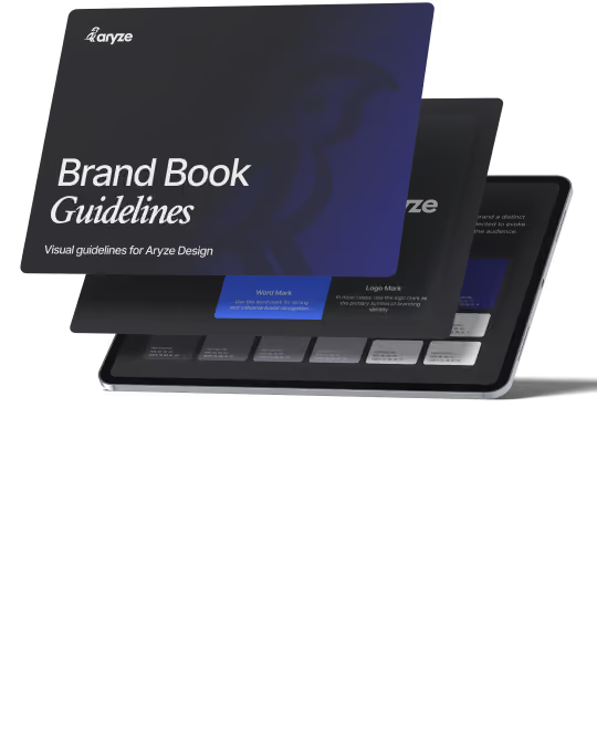
"Brand guidelines" were mentioned earlier as one of the assets to watch for in your logo package. They're what tie everything together, handed off to the printer, the media, event organizers, new hires, video editors, anyone who touches your brand. Without them, your colors drift, someone builds a slide deck in whatever font the tool opened with, and the brand you paid for comes apart across a dozen files.
What Belongs In Your Brand Guidelines
This is all the side of your brand people see. What they read is doing about as much work, and among advisors it tends to be the piece that's all over the place.
Your Financial Advisory Firms Voice and Tone
A big piece that ties into your brand that a lot of advisors aren't even thinking of is your messaging. Your messaging is a huge part of your brand and yet one of the most inconsistent pieces among advisors. Especially with more reliance on AI, your voice and your tone play a heavy role on your brand perception.
Brand Attributes: Three to Five Words You Want Landing
Attributes are the characteristics you want a prospect walking away with.
A rather clever test is to imagine a competing firm holding a straight face while claiming the opposite attribute. If you're not following, think about another advisor claiming they're unprofessional. That advisor would likely be grinning, stumbling, looking confused, etc.
In contrast, let's say "we take things slow" is your brand attribute, valuable to those who want an in-depth, smooth process. Your competitor could pretty easily claim they do things fast, right?
Words like professional, trustworthy, client-focused, experienced and personalised are all attributes that everyone has heard before. Whereas attributes like unhurried, blunt about fees, fluent in how your industry pays, reachable between meetings, and opinionated stand out and differentiate yourselves from competitors.
Your Value Proposition Is One Sentence
Your value proposition is what your target market can expect from working with you, said plainly enough that a prospect knows within a few seconds whether it's aimed at them. Most advisor value propositions describe the firm, the ones that work describe the client's situation.
Your value proposition is one sentence that tells a prospect what they get from working with you, said plainly enough that they know in a few seconds if it's meant for them. If you ask ten advisors for theirs, you'll probably hear some version of "comprehensive financial planning for individuals and families." That just describes the firm. It could apply to pretty much anyone in the business, so a prospect moves on. A stronger one describes the client instead.
Tone: Pick One and Write It Down
A formal tone works, and so does a conversational one. A firm serving estate planning clients in their seventies and a firm serving thirty-four-year-old founders shouldn’t sound the same, yet either can be excellent.
What breaks a brand is drift.
Your homepage sounds warm, your newsletter sounds academic, your LinkedIn sounds like a different person entirely, and a prospect trying to process it all comes away with absolutely zero read on who you really are.
Your One-Page AI Voice Document
Plain Language Is a Brand Decision
Roughly 86% of adults read at an 8th-grade level or below, and that number doesn't drop as net worth climbs. A surgeon with four million dollars in assets still doesn't know what sequence-of-returns risk means, and they're not going to ask you on the first call.
What’s worse? That surgeon is so busy that putting any strain on their cognitive load will make them bounce faster than your average joe.
Every term you don't translate is a small moment where a prospect feels behind.
Saying "asset allocation optimization" will fly right over most people's heads, but saying "how your money gets divided up" makes more sense to people who don’t understand your line of work.
None of that means talking down to people but just doing the translation yourself instead of leaving it to them.
Sounding Human Inside the Compliance Lines
With compliance, voice is where advisors regularly give up first, usually after a piece of copy comes back marked up. The constraints are real, and they're narrower than most industries.
Performance claims, testimonials, and anything that reads as a promise all carry rules under FINRA Rule 2210, retail communications often need pre-approval, and everything gets archived. What those rules restrict is what you can claim. They say nothing about whether you write in short sentences, use the word "you," or explain a concept the way you'd explain it out loud.
Keeping Consistency Across Every Touchpoint
Nobody decides to let their brand slip. They’re not willingly choosing to dilute their brand (they’re unknowingly doing so). Perhaps you work in a lot of different applications, have multiple employees, don’t have easy access to your brand assets, or didn’t pay for a proper logo and brand deliverables.
Whatever the case may be, it’s important to take the extra few minutes on each new tab or app and fill out the profile picture, name, links, etc. It’s worth a designer stepping in every now and then to build you something new (even if it’s a template so you can manage it more efficiently). It's okay to set something up and spend just a bit more time making it easy to hand off or update later, so it doesn't fall on you every time.
It’s pretty quick to run a simple audit, a little harder to get it all fixed.
- Pull up your homepage on your phone, and check that the logo, colors, and fonts still match your overall brand, not just what's on your laptop
- Search your firm name and see if the description, photo, and colors Google pulled in still match your current branding
- Open your email signature in Outlook, Apple Mail, and Gmail, since fonts and spacing can render differently across email clients
- Compare the last proposal and the last plan cover you sent a client against your current logo and color palette
- Line up every social profile image and banner side by side and check for old logos, outdated colors, or mismatched crops
Now, consistent doesn't mean identical. A LinkedIn post shouldn't look like a disclosure document, and a seminar slide shouldn't read like your homepage. Your tone can flex by channel while the identity underneath stays put.
What has to hold steady is the palette, the type, the logo treatment, and the way you describe what you do. Everything above that can move to fit the room.
That covers keeping a brand intact.
Refresh, Rebrand, and Which One To Do First
You can probably tell if your brand doesn't match where your practice is now. Maybe the site's clunky and slow, the logo looks like it's from a different decade, or nothing about it feels like the firm you've built since. Some advisors can point to exactly what's wrong. Others just know something's off and can't quite name it.
Which One You're Actually Doing
The Signals
Some are obvious. The logo was designed by someone on Upwork or Fiverr, two firms merged and you're still running both marks, or a partner left and their surname is on the door.
Some are subtler. The brand looks good and it's aimed at the wrong niche. A polished, traditional identity built when you served retirees does nothing for the business owners you've spent three years moving toward. Nothing about it looks broken, so nobody flags it, and it slowly pulls in the prospects you're trying to grow out of.
If your last five ideal clients came from referrals rather than your website, that's maybe something to sit with and think about.
Let’s say you do a rebrand, you’ll want to keep the old domain and point it at the new one rather than simply letting it expire. Map every existing URL to its replacement with a 301 redirect, page by page, since the years of credibility attached to your old blog posts transfer through those redirects.
Get Google Analytics and Search Console set up on the new site before launch day, not after. Without a baseline you have no way of telling whether a traffic dip is the rebrand or the season.
Then update everywhere your old name still appears: your Google Business Profile, directory listings, custodial paperwork, professional association profiles, and any site that links to you. Every one of those links is either pointing somewhere useful or pointing at a dead page.
The other half of a rebrand is telling people, which gets forgotten. Your existing clients should hear the new name from you before a logo they don't recognise turns up on a statement.
A short email a week or two ahead usually does it. What's changing, what isn't (their advisor, their accounts, their fee), why you did it, and what’ll look different next time they log in.
Ask an advisor what a brand is and you'll get the logo and the colours. Hopefully by now that answer feels thin. Your name, your mark, your palette, the photos, the way you write, and everywhere you show up either matches or doesn't, that's the brand. Nothing above is complicated on its own. There's just more of it than anyone tells you when you're picking out a logo.
We brand financial advisors, and we build the websites those brands end up living on. If you want a set of eyes on yours, we run a Free Assessment that takes about 30 minutes and covers where you're at, where you want to be, and what we'd do to close the gap.
Ready For The Next Step? Book Your Free Assessment Today
Book a 30-minute chat and we'll figure out together whether we're a good fit. You'll leave with a clear first move either way.