Financial Advisor Websites That Get Booked Calls
A complete guide to financial advisor website design, walking through the hero, imagery, StoryBrand homepage messaging, high traffic pages, SEO, AEO and GEO, site speed and accessibility, and how the main website builders compare.
Table Of Contents

The Financial Advisor Website Conversion Flow

What a High-Converting Financial Advisor Website Shows First
Having worked with countless advisors, we at Aryze built a conversion flow framework that financial advisor websites should follow if you want to see higher engagement, traffic, and conversions.
To help you get the most value out of it, we’ve written this overview to address quick wins all the way through to fundamental technical structure. The latter is the more complicated, intense stuff but it’s also what keeps people on your website.
Getting into it, what’s the first piece a prospect interacts with on your website? It’s your homepage’s hero. So, that’s where we’ll start. You’ve got 2.5 seconds before a visitor bounces. We use a grunt test: could a caveman look at that first screen of your website and instantly get what you do, who it’s for, and see their desired state of what to do next?
Typically, a read goes from the heading, to the paragraph, to the CTA, and possibly scans the tagline. Since the headline is doing most of the work to hook someone, ask yourself: does it come across as generic, or niche-specific?
The description should expand on what you do and who you do it for by touching on that said desired state. Think of it as the sentence that answers the question your headline just raised: okay, but how?
The CTA should be highly actionable. For advisors, this means pointing to your booking page; but, instead of just sending them straight to book, send them to a page that addresses who you do your best work with, answers their questions, and pre-qualifies them. Unless you need to vet bad prospects out, use a scheduling tool like Calendly, Cal.com, or Acuity (not a contact form, boo).
In a lot of cases, advisors’ CTA’s get flagged as “non-descriptive.” That means they point somewhere but it’s not clear where since the button text is just flat-out generic. This usually comes up as “Learn More” or “Get Started.” Instead, use language like “Free Assessment” or “Are We a Fit?” This isn’t purely exclusive, but these are the CTAs we use most commonly across our builds and what we see across other top-performing financial advisor websites.
Taglines must assert something valuable, or drop them. They can be a great use of space to communicate a quick point about what differentiates you from others.
That’s the hero. Next, on to imagery.
Website Imagery That Shows Your Prospect's Ideal State
The photos on your site should show your prospect's ideal state: the life they're aspiring to by working with you. That could be an image of someone like them retired someplace specific, exiting a business that runs without them, spending time with their kids on vacation, something simpler or crazier.
Inconsistent imagery is a very big tell of a DIY site. The quickest way to fix it is to generate the images using the best AI image models or hiring a photographer to take a shoot with your team.
The thing is, real photography, shot for your practice, is the gold standard when you can get it. Most advisors can't justify the price behind a custom shoot, which is where AI-generated lifestyle sets come in (they’re nearly indistinguishable from real photography these days).
AI Imagery, Things To Look Out For:

If you’re looking to generate some images yourself, a few of our best tips include adding the word “candid,” referring to the quality (“high-res,” “realistic,” “4k,” “shot on a [camera],” etc.), using a good reference, describing in detail what the image should look like, addressing the lighting, and messing with the settings on your AI image generation software.
See examples of this done well, crafted by our team at Aryze.
Make Your Prospect the Hero With Homepage Messaging
The scroll past the hero, below the fold, often switches up from being about the prospect to being about you (the advisor). Which, really, is a ‘big no no.’
We tend to fix that by flipping who's who. Your prospect is the hero of the story, you're the guide who gets them where they're going. We use a mix of Donald Miller’s Storybrand approach and our own Aryze framework on nearly every financial advisor website we build.
A page built this way allows for good internal linking, clean structure, and a consistent look, since the whole thing is organized around your niche. The more niche you go, the more repeatable your process becomes. You can reuse the same approach for lead magnets, imagery, and other marketing assets instead of starting from scratch each time.
The Homepage Blocks Below Your Hero, In Order
Right under the hero sits your accolades strip. Typically, this takes shape through a collection of “as seen on,” “featured by,” or “trusted by” logos. Scrolling marquees make it skimmable while a wall of badges puts heavy emphasis on those logos. So, if you’re going to do that, make sure your marks are from firms, publishers, or people your prospects really care about).
Pain points come next. The external problem is what they'd say out loud (accounts scattered across four places, no idea what the tax hit looks like). The internal problem is what they'd never say out loud (they feel behind, a little stupid for not handling this sooner, worried a professional will make it worse). Naming the external one is just table stakes, naming the internal one is what moves people. As for how many to include, we opt to keep it between 2 and 5, with 3 being the average.
Next up is your lead magnet, which acts as a small value-add for those not quite ready to commit yet. Tying it directly to their pain points is often a good idea, assuming you’ve nailed your prospects’ biggest concerns in the previous section.
Pick a checklist, a guide, or a case study, whatever fits the concern you settled on above. Then put the work in and make it good. You'll get the email either way, but the one who reads it cover to cover and gets something out of it is the one who writes back. Aim for somewhere between 3 and 9 pages, packed with things they can go and act on, with no filler padding it out.
Now, we finally get to the benefits bit (but it’s still not about you). What might it look like a year out if this gets handled, set against what it costs them if it doesn't? State your differentiators, like previous jobs within your niche, fiduciary status, or maybe you have a totally unique approach.
Keep your about section short: either a paragraph on why you do this work that speaks to what your prospect cares about, or a short blurb on something unique about your firm that ties back to their needs.
Then comes the process. When we say “process” here, we mean your prospecting process (not onboarding). We see anywhere between 3 to 5 steps, with the most consistent approach being an intro call, discovery meeting, and assessment review. The first runs 15 to 30 minutes, the second might run up to an hour, and the third is often a deliverable or another call.
Close with testimonials from someone in their exact situation (If your compliance allows). The accolades strip told them you're legit enough to keep scrolling. This tells them someone like them took the leap and had success.
Your Free Assessment Page
The "Free Assessment" or "Are We a Fit" page ties directly into your primary CTA and sees some of the highest traffic on a financial advisor site, across our builds.
A good part of that comes down to the offer. Prospects who aren't ready to commit to anything will still click something low-risk, and a free, no-pressure assessment is about as low-risk as it gets (outside of the lead magnet).
The page setup is simple: describe the offer, clarify who you do your best work with, supply them with the process, address any questions they might have, and embed your scheduling tool.
Put in a little more depth: your prospects want to commit just to meeting you first, feel like you get them, see what the time commitment is gonna look like, ask questions about what happens on the call, how long it takes, if they need to bring anything, or if there’s a catch, and have a seamless booking experience.
Financial Advisor Website Structure: The Six Pages That Earn Their Place
The way we build our financial advisor websites at Aryze works like this: a page is justified by the level of engagement it sees and the action it drives. We've built complex financial advisor websites and simple ones, but certain pages show up across both because they've justified their place in the core structure. Our typical core page structure, though, consists of the following:
Beyond those, a few pages aren't optional: disclosures, a privacy policy, and a client login if you offer one. Skipping a disclosures or privacy policy page can get you into some hot water with your compliance team. If you have client login pages, skipping that can really frustrate your clients, and leave them constantly emailing you asking for the links.
Adding pages that don't pull traffic or engagement dilutes your site. Every extra page splits your authority, adds another dead end for prospects to wander into, and gives search engines more thin content to sift through. Consolidating into this core structure keeps every page pulling its weight, keeps the path to booking short, and makes the whole site easier to maintain as you grow.
The page advisors avoid the most is Services/Pricing, usually out of a worry that publishing numbers scares people off. Truth is, it actually does the opposite, it filters. The right prospects see your pricing, know what they're getting into, and book with real intent. The wrong ones self-select out before they ever get on a call with you. At minimum, give them a starting number, whether that's AUM-based or a flat fee.
Your navigation should only carry the pages someone needs to find fast. Everything else, privacy policy, disclosures, that kind of thing, belongs in the footer. You don’t want to overwhelm your prospects with a million pages right at the start. The longer they spend looking for what they want, the more likely they are to bounce.
Under the hood, clean URLs (/retirement-planning, not a string of numbers), a clear header hierarchy, and links between your pages so nothing on your site is a dead end.
SEO, AEO and GEO Guide for Financial Advisors
What SEO, AEO, and GEO Are
There's a common misconception that SEO is as simple as building a website that draws traffic in. But, it's not. SEO is made up of several distinct pieces working together: your on-page SEO (content, structure, keywords), the links pointing to your site, your Google Business Profile, your social presence and mentions, and the technical health underneath all of it, speed, structure, accessibility. AEO and GEO now sit alongside and are built on top of these.
Between SEO, AEO, and GEO, there’s a lot to unpack. Starting with plain definitions:
SEO (Search Engine Optimization) is the foundation: the practice of making your site findable and understandable to search engines like Google, DuckDuckGo, and Yahoo.
AEO (Answer Engine Optimization) takes that same foundation and structures it to get pulled into a direct answer: a featured snippet, a voice response, or an AI summary, instead of just ranking a link on the results page.
GEO (Generative Engine Optimization) stretches it further still, covering how your content and reputation show up across AI tools generally (ChatGPT, Perplexity, and beyond), not just traditional search engines.
Same groundwork throughout. AEO and GEO are strategies built on SEO, not separate practices.
Keywords are the words and phrases your content is built around to match what people search for.
Meta tags carry info a search engine reads to understand and display your page. Two key parts are your meta title (60 characters, the clickable headline in search results) and your meta description (160 characters, the summary underneath it).
Backlinks are other sites linking to yours, a trust signal to search engines. Internal links connect your own pages together, external links point to credible outside sources.
Alternate text (alt text) describes an image for anyone who can't see it.
E-E-A-T, Experience, Expertise, Authoritativeness, Trustworthiness, is the lens search engines use to judge whether content deserves to rank, especially in finance.
Financial content falls under Google's YMYL (Your Money or Your Life) guidelines, requiring exceptionally high E-E-A-T to rank as the info can directly impact a user's financial well-being.
Keyword Strategy: Build Topic Clusters, Not Single Keywords
Clearing that bar starts with what you're trying to rank for in the first place, and the sweet spot is finding keywords with high search volume that are still easy to rank for. Earlier-stage sites should target 0-15% difficulty with 100-1,000 monthly searches. Stronger domains can push into 16-29%. Long-tail phrases ("401(k) rollover options for self-employed individuals") pull less traffic than a broad term, but convert better since the searcher already knows what they want.
Build clusters around one core topic instead of chasing single keywords. Retirement planning might branch into retirement income planning, IRA distribution strategies, and long-term retirement goals, all reinforcing the same theme. These clusters make for great blogs, anchor pages, and content ideas.
Heading Hierarchy: Writing for Search and for Readers
Those cluster terms have to land somewhere on the page, and headings are one of the best spots for them. Heading hierarchy is the order you tag your headings so search engines and AI alike can understand your site's structure. H1, H2, H3, and so on down to H6 are all headings, the tags that break up a page's content, just at different levels. Your H1 is the biggest one, the page's main title, and there's only one per page. H2s mark off each major section underneath it, and H3s sit inside an H2 for a smaller sub-point, with H4 through H6 available if you need to nest even deeper.
Skip a level, or pick a heading size because it looks right rather than because it reflects the actual structure, and you’ve effectively skipped a heading level, making the page harder for both a visitor and a search engine to follow.
Schema Markup for Financial Advisor Websites
Headings carry the shape of a page, but the meaning behind it is hard to parse unless every piece is labelled for what it is. A visitor reading your about page can tell that CFP® is a certification and that Meridian Wealth is a firm. A crawler is guessing until you label it, and schema markup is the label.
Every type you'd add maps onto a page you already have. FinancialService or LocalBusiness on your homepage and contact page covers your name, address, phone, hours, and service area. Person on each bio attaches credentials and job title, which feeds straight into E-E-A-T. BlogPosting on each post carries the author and publish date. Service goes on your service pages.
Whatever you mark up has to match what a visitor can see, so marking up a five-star review that appears nowhere on the page gets the whole block ignored.
FAQ schema comes up constantly, and it's worth knowing Google retired the expandable Q&A dropdown it used to earn you back in May 2026. The markup is still valid and harmless to leave in place, it just won't show up in search anymore.
The Results Page Rewards More Than Rank
That dropdown disappearing is one small piece of how much the results page has changed, and ranking #1 carries less weight when answer boxes sit above it. Featured snippets pull a tight 40-60 word answer straight from a page, best hit by answering a specific question directly with a header that mirrors how it's phrased. People Also Ask boxes double as free keyword research and a shot at ranking there yourself. AI Overviews reward the same thing taken further, clear, comprehensive answers in your own voice.
Local SEO for Financial Advisors
Plenty of those answers are local ones, someone nearby searching for what you do on Google, Bing, Apple Maps, or asking an AI tool for a recommendation. Your Google Business Profile still carries a lot of weight: an accurate name, address, and phone number, location-based language in the description, photos, and reviews, all of which factor into E-E-A-T. Your website's copy needs that same location-specific language, schema markup tells search engines and AI crawlers where you're located and who you serve, and citations across directories need to match your details too.
Making E-E-A-T Work For You
Matching details across directories feeds the same credibility read E-E-A-T is built on, and that read gets built everywhere else too. Every blog needs a real author linked to an author page with a headshot, credentials (CFP, CFA, ChFC), years practicing, and a focus area, and that bio should link back to your firm's about page so the credibility ties to the business. Show a publish date, and update it whenever the content changes. Your about page, team bios, and any reviews on Google or your site carry the same signal, so list credentials and licenses (CFP®, Series 65, RIA name) explicitly and consistently.
Older content loses ranking if left untouched. Refresh statistics, update internal links, and adjust keywords periodically to keep them earning their spot.
Where AEO and GEO Fit In This All
Those same author bios and credentials are what an AI tool leans on when it's deciding who to name, because AI search optimization for advisors runs on the same work as everything else, strong content, clear structure, credibility signals, and a technically healthy site underneath it. That's what feeds a featured snippet, an AI Overview, and a ChatGPT recommendation. Google put it in writing in May 2026, publishing its first official guide to generative AI features in Search and framing the whole thing as "optimizing for the search experience, and thus still SEO."
Two ideas from that guide are worth carrying into how you write. Non-commodity content is Google's term for material that goes past common knowledge. "5 Tips for Planning Your Retirement" is commodity content anyone could have written, including a chatbot, while "What I Tell Clients Who Want to Retire Three Years Before Their Pension Vests" only exists if you've sat across from that client. Google calls it the biggest lever in the entire guide, ahead of every technical fix in it.
Query fan-out is the second. Ask an AI tool a broad question and it spins off a batch of related queries behind the scenes, so someone asking about retiring at 62 sets off side queries on Social Security timing, bridge income, and coverage before Medicare. One page that covers the topic properly can get picked up through several of them at once, and Google is direct that building a separate page for every variation tips into its scaled content abuse policy.
The guide also names what you can skip: llms.txt files, chunking your content into fragments, and AI-specific schema. Which matters, because you've probably had someone pitch you a GEO package built around exactly those three things and priced like a separate discipline. You've got one clean question to ask back: does this match what Google's own documentation says? If the answer's no, you already know what you're being sold.
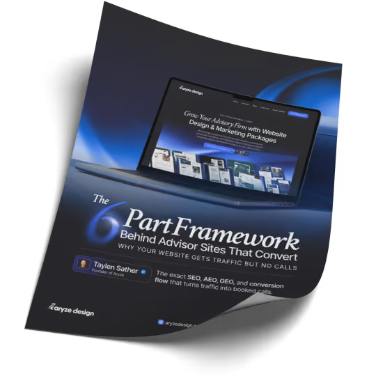
6 Fixes to Turn Traffic Into Booked Calls (Free)
SEO + AEO/GEO to get found, plus the design and conversion fixes to get booked.

Technical Layer Under It All: Speed, Crawlability and Accessibility
The technical side rarely wins you a ranking on its own, though it loses them regularly.
Speed comes down to a handful of concrete levers. Images like .JPEG and .PNG carry a bunch of weight, whereas compressing them into .AVIF or .WEBP files makes them much lighter for the browser. Removing unnecessary scripts can help, too, although cleaning up the underlying code is a little more technical and usually something you’d leave to a developer. You can also use a CDN, which helps your site load faster by delivering files from a server closer to the person visiting your site, and lazy loading, which stops images lower down the page from loading until someone scrolls to them. Put those together and you’ve got a good chance of hitting 90%+ on Lighthouse and a load time under 2.5 seconds. There’s a lot more that goes into website speed, but this is the short-and-sweet version of the biggest things an advisor could look at.
Responsiveness is a related but different problem: whether your site works on the device someone’s using. Fluid units—sizing things with relative measurements like percentages, rem, em, and viewport units instead of fixed pixels—let your layout scale smoothly across different screen sizes rather than looking great on your laptop and breaking on a phone. Combined with proper breakpoints, this is what makes one site work everywhere, rather than needing a separate stripped-down mobile version that always ends up half-maintained.
Crawlability comes down to whether Google can find your pages at all. Submit an XML sitemap through Google Search Console, confirm your robots.txt isn't blocking anything you want found, and check the indexing report every month or two for pages that dropped out. Search Console is free, and it’s one of the best places to see which search queries your site is already appearing for.
URLs count as content too. yoursite.com/retirement-income-planning tells a search engine and a person the same thing, while yoursite.com/page?id=4417 tells neither of them anything, and when you move or rename a page, 301 redirect the old URL so the links pointing at it keep their value.
Accessibility runs on these rails as well. Strong color contrast, visible focus states for keyboard users, live text instead of words baked into a graphic, all of it helps a person using a screen reader and a crawler at the same time.
There’s also this thing we call semantic tagging. See, your nav, sidebar, footer, and more needs tagging too, and that's what tells a crawler which part of the page is your actual substance.
Finally, analytics show you what happens once people are on your site. Free tools like Google Analytics tracks things like traffic sources, pages visited, and conversions, while Google Tag Manager lets you set up and manage more in-depth tracking. Microsoft Clarity adds another layer with heatmaps and session recordings, so you can see where people click, scroll, or get stuck.
Choosing The Right Advisor Website Builder
There are a lot of website builders for financial advisors out there, so here's a quick rundown of the ones worth knowing. This isn't exhaustive, just the names you've probably already heard or considered.
Webflow
Our favorite here at Aryze, built for both design and development in one tool. Different roles let you match access to skill level, and we recommend most advisors stick to the marketer role so they can update content without breaking anything. The CMS handles blogs, authors, events, and podcasts with ease, and skipping plugins means nothing extra to maintain.
WordPress
Still a capable builder, but its plugin dependency tends to create extra cost, confusion, and complexity down the line. It's stuck around mainly because of how big its ecosystem got years ago, and few advisors have gone back to check if it's still their best option. That same size makes it slower to adapt to newer tools built with fewer moving parts.
Framer
About as complex to pick up as Webflow, and a bigger learning curve than Wix Studio. It's mostly a designer's tool, and it competes directly with Webflow and WordPress, though it's not a tool we'd ever really recommend. It's built for speed of design, which often comes at the cost of the functionality you'd get building the same site in Webflow or WordPress.
Squarespace
Easy to pick up for a DIY approach, using a grid-based system to drag and position elements. Design flexibility and responsiveness cap out fast, which is why a professional designer or developer rarely reaches for it. Still a reasonable option for an advisor building solo and keeping things simple.
Wix Studio
A step up from Squarespace, especially with Wix Studio, which edges closer to the more advanced builders without fully closing the gap. It's more capable than Squarespace, but that comes with more complexity to learn along with it. Still a solid pick if you want to keep costs down now and go professional a few years out. Be warned though: it may cost a chunk of your own time.
FMG Suite
Built specifically for advisors, with an ongoing monthly fee to keep the site running. The editor lags behind everything else here, often needing manual workarounds and code to get things right. That comes with an upfront cost on top of a higher-than-average monthly bill.
WealthReach and other AI-driven builders
These are newer platforms promising a fully custom site for an ongoing fee, but AI-built sites tend to look the part, generic and templatized. You can get a decent result building it yourself with one of these tools, but it still costs your own time, and the average advisor's hour runs about $300. Weighed against that, hiring it out usually comes out ahead.
Hiring a Specialized Designer or Developer
The most expensive (and extensive) option, and for good reason. Quality varies a lot from one designer or developer to the next, so what you get really depends on who you hire. At Aryze, we prioritise speed, structure, SEO, and conversion from day one, so the site is built to drive traffic and hold up under real engagement, with load times under 2.5 seconds. Builds typically take three to four weeks. It costs more upfront, but a site built to perform more than pays for itself over time.
Whichever platform you land on, ask the same three questions. Do you own the final site outright? Is the pricing fixed, or does it creep? Are revisions clearly scoped, so you're not left guessing?
Where All of This Comes Together
All in all, websites are complex. What’s more? Financial advisor websites are complex. There’s a lot that goes into them, a right way of building them, and a wrong way of building them. Layers upon layers that make your website stronger than your competitors and, more than likely, lots of areas for you improve on. This guide isn’t extensive, it just touches on a lot of the things your build needs.
We build websites for financial advisors. High converting ones. They load extremely fast, are designed custom to your brand, and follow all the principles you just read above. If you want us to take a look at your website, to audit it, and to provide our recommendations (or if you just want to skip the whole process and get building immediately), reach out to us! We’ve got our very own “Free Assessment” that runs just 30-mins and walks you through where you’re at, where you’d like to be, and how we’d help you get there.
Ready For The Next Step? Book Your Free Assessment Today
Book a 30-minute chat and we'll figure out together whether we're a good fit. You'll leave with a clear first move either way.